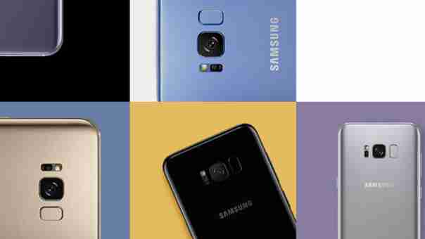
Following months of speculation and an incessant deluge of leaks , Samsung unveiled its brand new Galaxy S8 flagship at a special event in New York City last week. Now the company wants to share how its creative team came up with the gorgeous design for the handset.

In a new press release , Samsung takes us behind the creative process for the Galaxy S8, offering an insider view on the marvelous form factor of the phone as well as its slick, almost bezelless ‘Infinity Display.’
As Samsung puts it, its creative team sought to design the ultimate “manifestation of holistic oneness” with its new flagship, crafting a body that “merges the user and device as one.”
In a similar vein, the decision to ditch the iconic home button served to “expand user space and shatter the boundary between the device and the real world.”
The South Korean heavyweight also took a moment to discuss the revamped user interface , stressing the emphasis on seamless design and effortless functionality:
Samsung similarly dwelled on its motivation for adding a dedicated physical button for its freshly-introduced voice-enabled virtual assistant Bixby.
Speaking about the new feature, the company said the virtual helper will make it easier for users to receive optimized information and tailored content, reminding that Bixby is constantly evolving as “users interact with it.”
While Samsung stole the spotlight from fellow competitors with the launch of its gloriously designed flagship, we’re yet to see whether the device can live up to the initial hype. Its previous Note 7 flagship also got off to a flying start , but we all know how that ended . Let’s hope the future is kinder to the S8.
Head to this page to read the full story behind the design of the S8.